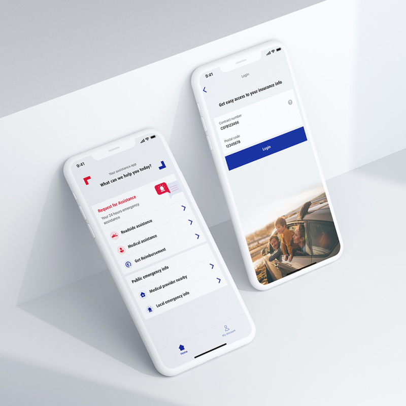
We got the chance to redesign a mobile app for Europ Assistance. The goal of this redesign is to have a stronger interface that aligns with the new branding and to have a much better user flow.
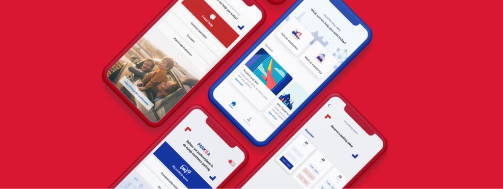
We got the chance to redesign a mobile app for Europ Assistance. The goal of this redesign is to have a stronger interface that aligns with the new branding and to have a much better user flow.
Europ Assistance, part of Generali, is one of the largest insurance providers in the world. The company offers travel insurance, cancellation insurance, roadside assistance and operates through 33 countries around the world. We are the lead digital agency for the Belgian market.
The EA service app has a complicated interface because of the outdated design, and we need to redesign it to align with new company branding
We’ve undertaken a redesign of the app, building upon the existing structure to ensure a seamless transition for our current users. Our primary aim was to minimize confusion while enhancing the overall flow for efficiency.
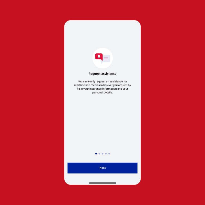
One notable improvement is the streamlined process for requesting assistance. We’ve worked to make this process transparent and straightforward, simplifying each step.
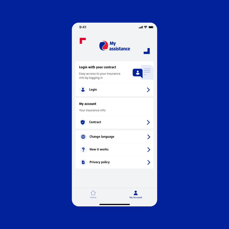
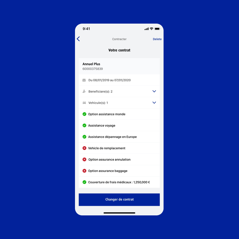
Additionally, we’ve introduced new features, including an account profile function. This empowers users to effortlessly access and manage their insurance information, spanning coverage details, contracts, and personal data modifications – all conveniently within the app.
Visual aesthetics also received attention. Our redesign promotes a cleaner look, aligning with the principles that mobile design should be attuned to user preferences and objectives. The adoption of simple, clean design elements serves as a powerful strategy to accelerate user engagement and satisfaction. Ultimately, this approach contributes to a more comprehensive and gratifying mobile experience, catering to users’ diverse goals.

Related Case study
This website uses cookies. By continuing to use this site, you accept our use of cookies.