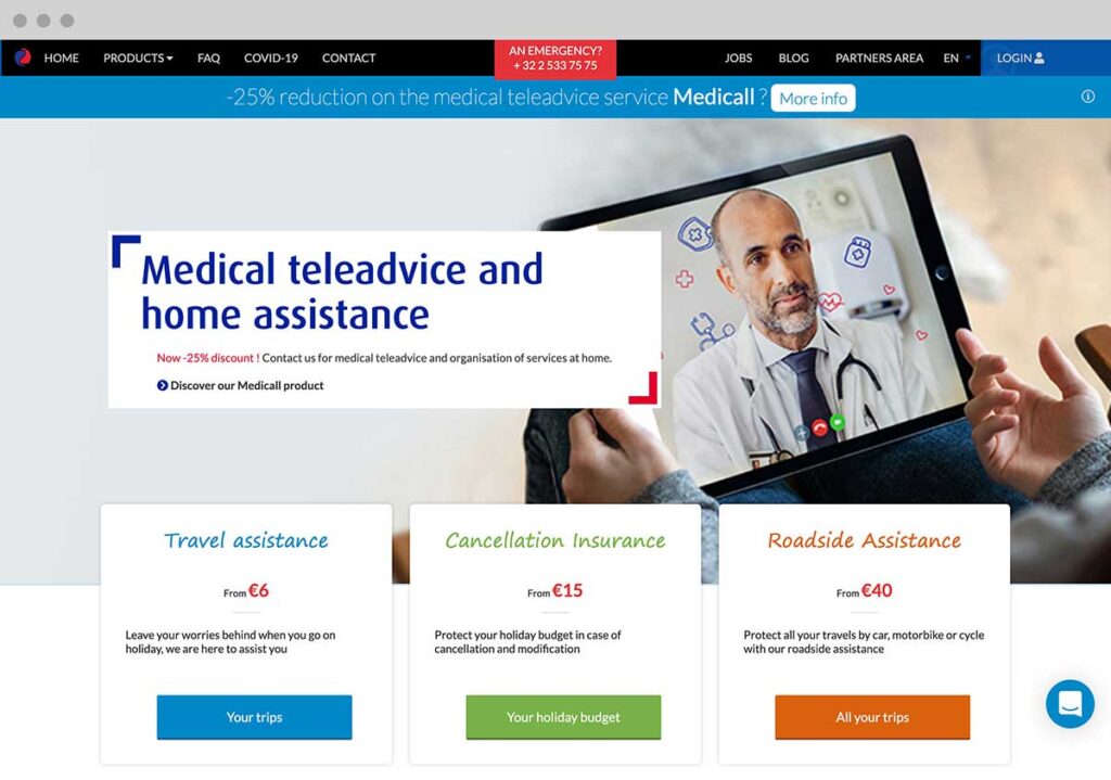
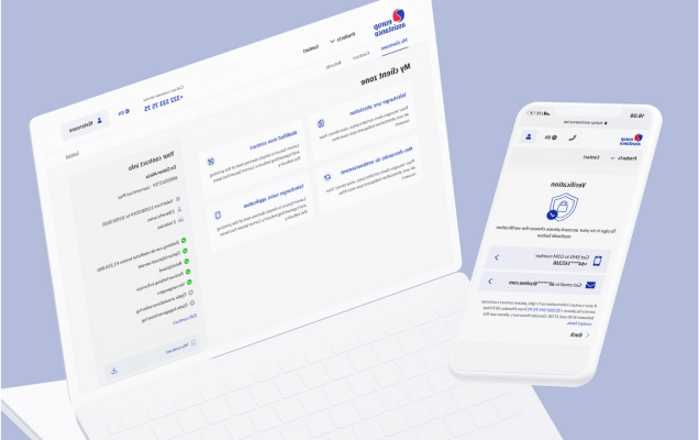
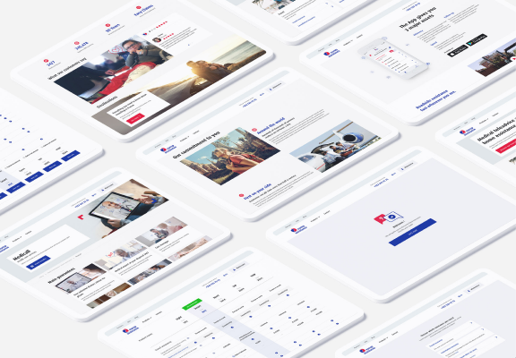
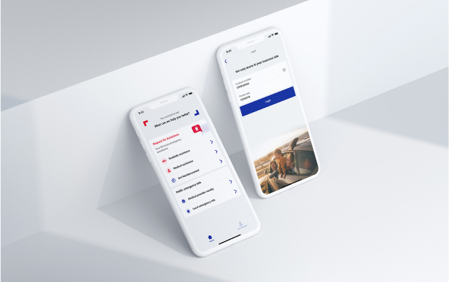
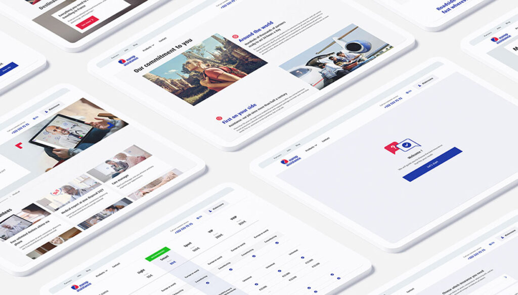
We got a chance to redesign the website of Europ assistance. The goal of this redesign is to have a stronger interface and to have a much better user flow.
Insurance website redesign
Background
Europ Assistance, part of Generali, is one of the largest insurance providers in the world. The company offers travel insurance, cancellation insurance, roadside assistance and operates through 33 countries around the world. We are the lead digital agency for the Belgian market.
Navigation
Problem
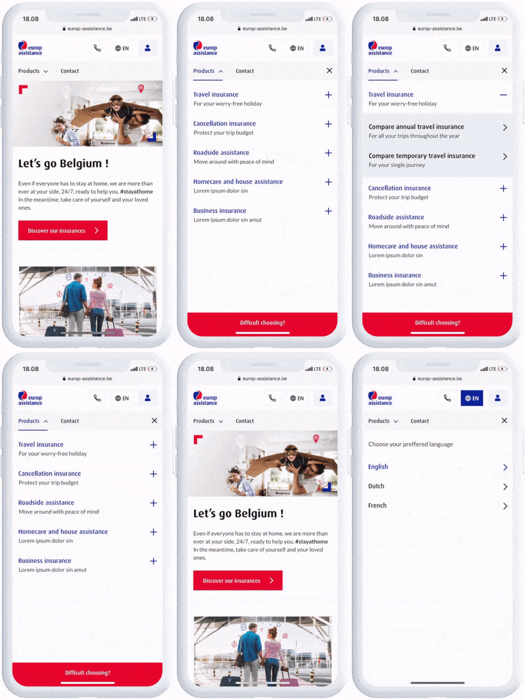
The lack of information on the top navigation created confusion for the customer to find the product they want, and since the website is outdated, it has limited navigation on mobile version and it’s not optimized.
Solution
Our goal for this navigation is to eliminate the confusion for any user both member and new user. Simple explanation added so it’s easier for a user to understand each product category, and in a subcategory, we show all the product list with an explanation as well plus a product recommendation and entrance to the product funnel to guide them to the best suits insurance product.
Product funnel
Problem
Outdated design, a lack of information for each option and not optimized in mobile.
Result
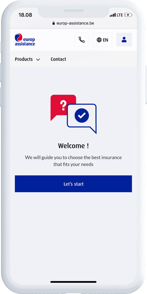
We’ve updated the design to achieve a more simplified and clean appearance. We’ve introduced a new Welcome page that provides an overview of the funnel’s purpose. Additionally, we’ve enriched each option with more detailed descriptions, allowing users to gain a better understanding of each option without the need to click the ‘information’ button.
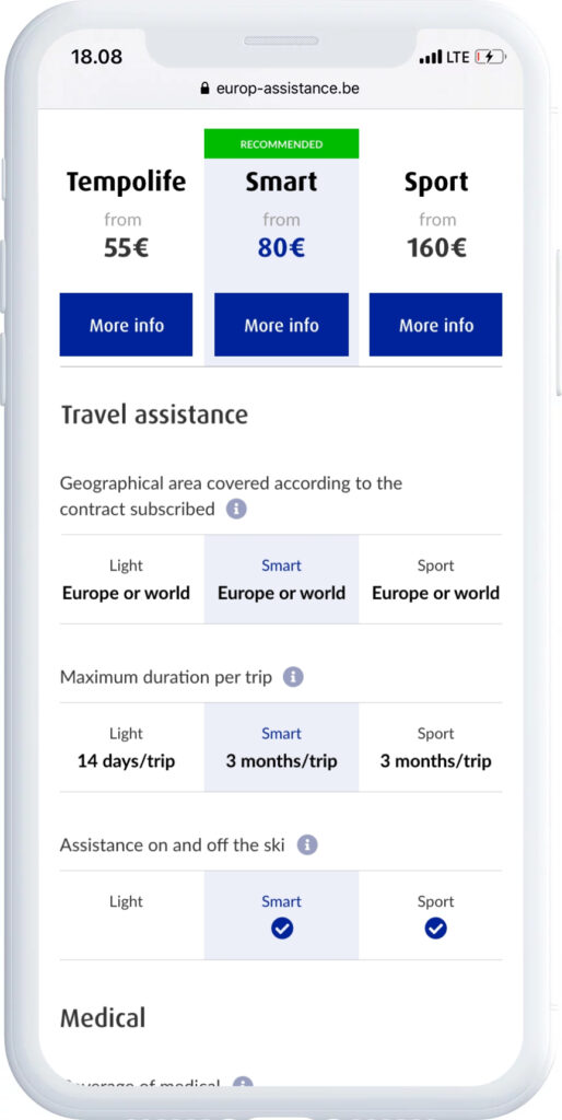
Product comparison page
Problem
Outdated design, a lack of information for each benefit and hard for user to compare each product.
Result
Clear information on each benefit, easy comparison and navigation through different products.
Related Case Study
