The Growth Agency’s team has reimagined the Europ Assistance customer zone, and the UX of their digital dashboards to meet the evolving needs of today’s digital-first clientele. This project has been a big step in redefining user experience in a mobile-first context and with a lot of care for the user journey.
UX optimisations of the customer zone and digital dashboard for an insurance client
Background
At The Growth Agency, we recently collaborated with Europ Assistance Belgium to improve their customer claims platform, a digital dashboard that is used by hundreds of thousands of clients yearly. Our goal was clear: make the platform simpler, faster, and more user-friendly. Here’s how we tackled this UX-UI overhaul and delivered a platform designed to make life easier for users, giving them fast access to their essential information and services.
Challenge: Streamlining User Experience on a Complex Platform
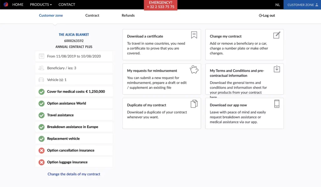
Europ Assistance’s existing claims platform had several challenges. Users had to navigate a mix of login options and several steps to view or manage their insurance contracts. The dashboard layout was cluttered, and users struggled to find core features like coverage, beneficiaries, or claims status. We saw an opportunity to simplify this platform and make the most crucial information easy to access.
Our Approach: Clearer Navigation and a User-Friendly Dashboard
1. Simplified Login and Account Selection
We started with the basics: making the login process easier. Our team merged various login options, creating a single, streamlined login page. For users with multiple accounts, we added an account selection page. This way, they could easily pick the contract they wanted to manage without extra hassle.
2. A Fully Redesigned Dashboard
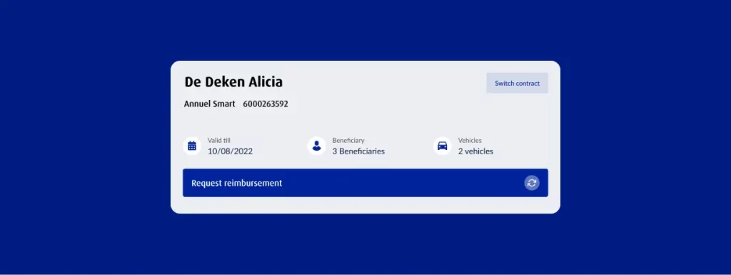
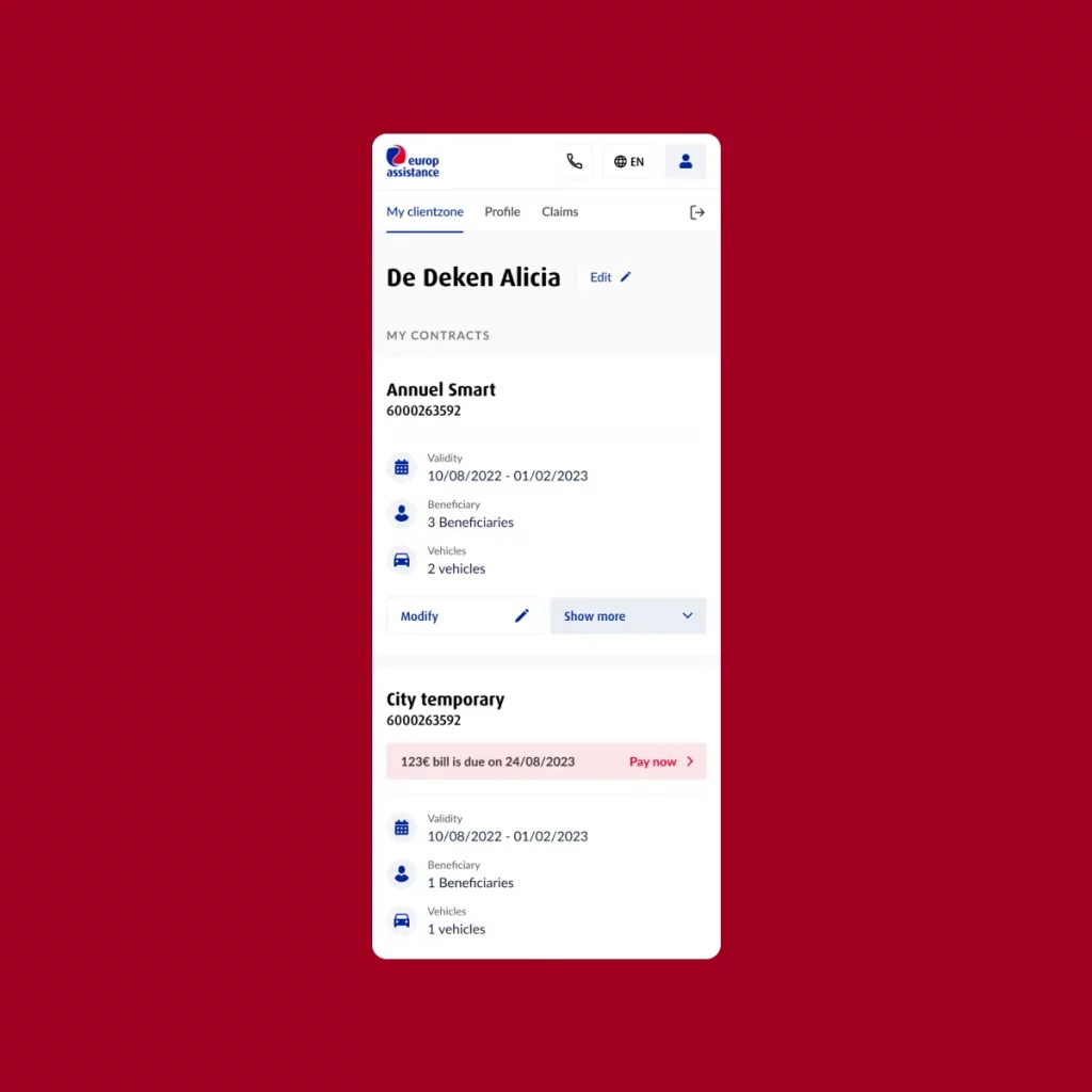
Our main focus was on the dashboard—transforming it from a column-based layout into a clean, full-width view. We organized the dashboard into expandable blocks for each contract. With a quick click, users could view their coverage details, beneficiaries, and claim management tools. We added sections like communication preferences and the ability to manage how they receive information (digital or paper). At the bottom of the dashboard, we created blocks for general tools, such as links to Europ Assistance’s mobile app and benefits platform.
3. Enhanced Features for User Control
•Coverage and Beneficiaries: Each contract block displays all essential details in one place. Users can see their coverage and beneficiaries at a glance, without digging through menus.
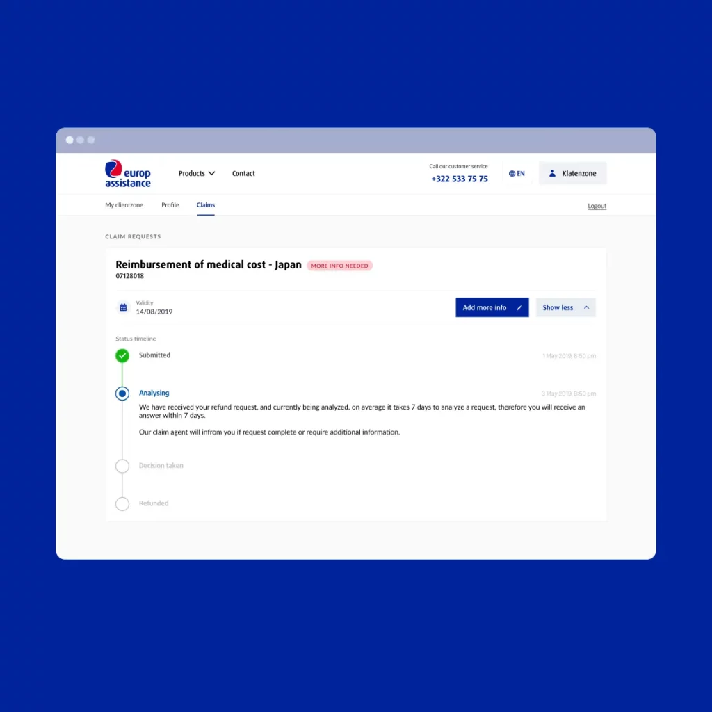
•Claims Management: The new design brings claims management to the forefront, allowing users to initiate or check the status of their claims easily.
•Preference Settings: We included options for users to choose digital or paper communication, a feature requested by Europ Assistance to support eco-friendly choices.
•Marketing Permissions: To comply with data regulations and customer preferences, we added a simple toggle for users to manage their marketing subscription directly from the dashboard.
Results: A More Efficient Platform That Puts Users First
Our redesign transformed the claims platform into a more intuitive and efficient experience. With the new layout, users can easily access their insurance contracts, manage their claims, and update preferences—all from one streamlined dashboard. By eliminating unnecessary clicks and providing a clear path to key features, we made sure Europ Assistance’s clients can focus on what matters: quick, reliable access to their coverage information.
Our work with Europ Assistance shows how a thoughtful UX-UI overhaul can improve customer satisfaction and support business goals by making complex services accessible and straightforward. This redesign not only enhanced usability but also demonstrated The Growth Agency’s commitment to user-centered solutions. We’re ready to help other clients achieve the same results—simple, effective platforms that make a real impact.
Overview
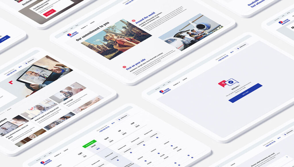
We’ve discarded the complexity of the past, opting for a minimalist and intuitive design that aligns flawlessly with the new website look and feel. Our team focused on user-centricity and every element of the redesign is reimagined this way. The result? Delivering a customer zone that’s not only visually appealing but also functionally superior, ensuring every interaction is straightforward, efficient, and satisfying.
Option 1
Option 2
UX Design option 1
Our redesign tactfully balances new features with the old design’s familiarity, ensuring that existing customers experience a smooth transition without a learning curve. This strategic choice enhances user satisfaction by offering a seamless and intuitive interface upgrade.
UX design option 2
Our second design option transforms the customer zone into a vertical scroll layout, prioritizing a clean and straightforward presentation. This design establishes a clear hierarchy, guiding users naturally through their insurance details. The emphasis on simplicity ensures that customers can easily find and understand their information, elevating the overall user experience with intuitive navigation.
Final design
Related Case study
